Tuesday 26 September 2017

Setup dev environment for spfx

So lets setup dev environment for SharePoint Framework abbreviated as SPFX. for an Introduction of What is SPFX and What are the capebilities of SPFX you can have a look on my previous post here.

Basics of SPFX

Step 1 : Install Node and npm

Go to http://nodejs.org and download latest stable release of nodejs. npm is installed with node js.
node provides run time for javascript and npm is package manager for managing packages and dependencies.
once installed open command prompt and type  node -v , it should display version number of nodejs installed on the machine.
similarly you can type npm -v to know the version number of npm.

Step 2 :   Install Gulp 

next  open a command prompt and type below command
npm install -g gulp 
this command will deploy gulp globally.
so gulp provides build process task runner for your spfx project.
for now you need not to know much about gulp except some commands for example for running the project in local workbench you will use command like gulp serve
Gulp actually does a lot of tasks which you will know as you progress with

Step 3 : Install Yeoman

Next install Yeoman globally. type below command to do that.

npm install -g yo

Yeoman provides starter templates not for spfx only but also for other types of node based projects.
it is similar to the visual studio starter templates.

Step 4 : Install  generators

Next install starter templates for spfx using below commands.
npm instal -g @microsoft/generator-sharepoint

this command will install SPFX generators.


Step 5 : Create and Run your Project

now you are ready to create your first project. open command prompt and navigate to your workspace (a folder in your machine where you want to place your source files). and run below command.

yo @microsoft/sharepoint

it will ask  a few questions like solution name etc as bellow

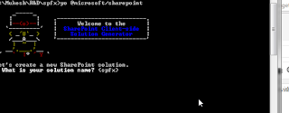
give answer to questions and you can do that easily. in one of the questions it will ask which framework you would like to use?
it gives three options for now you can choose any of them how ever i will be using react microsoft is also using react.

after this your project will be created. navigate to your project. on command prompt.

and type below command .
gulp trust-dev-cert

it will trust the development certificate. now for running the application use below command

gulp serve

When you run your project using gulp serve then you also need to allow in windows firewall so just allow when prompted.
it will run the project in local workbench as below.
you can click on Plus icon and add the webpart.

Workbench

Workbench is a page where you can test the spfx components before you actually deploy your component to office 365. 
there are two workbench one is local and called local workbench.
When you run gulp serve then your solution is opened in local workbench. so you can use local workbench for testing components before deploying them to office 365. but there are several scenarios that can not be tested in local workbench for example if you have written code to add a list item then you can not test in local workbench.
So for that case you have a hosted Workbench open your office 365 site and append following after domain name 
/_layouts/15/workbench.aspx

you will notice that when you click plus icon there then your local web part will be shown there.


.


Friday 1 September 2017

Basics of SPFX

SPFX is the new way or you can say a new development model in SharePoint based on open source technologies like nodejs , Gulp , Yeoman , webpack , reactjs , angularjs typescript etc.
SPFX is a development model that provides full support for client side development and deployment.

Normally, SharePoint developers work on  SharePoint Solutions that are based on features/solutions / javascript JSOM using Script Editor / content editor webpart or Apps (now addin). and so it is hard for them to learn and work on above mentioned open source technologies.

Since SPFX is based on client side development so it is going to be very popular in fact it is already. so every SharePoint developer should now start learning these technologies as these are going to be future of SharePoint.
We can use SPFX to develop powerful client side solutions for office 365 and Feature pack 2 of on-premise SharePoint 2016.

lets see some problems with old client side development ways and some problems with that

Script Editor

Script Editor is probably one of the most popular web part in SharePoint which developer uses to inject scripts in pages but the problems are.
  1.  It is not marked as safe for scripting.
  2. There are certain cases where NOSCRIPT feature is enables on most of self service sites. simply it can not be used there.
  3. You can not provide configuration options easily.

Addin Model

Addin model provides app parts which can be used in No Scripts scenarios but the biggest downside of  this App Part is that it loads in IFrame and caused several issue. if you solve them then it will take much time to load.

Key Features of SPFX Model

Now lets see what are some of the key features of SPFX.

  1. You should be using some javascript framework for development and of course you need to know at least one of them like Angular , Knockout , React etc.
  2. You can access the life cycle of controls like render , load , serialise , deserialise etc.
  3. Controls are responsive in nature , the solution runs in browser with current user credentials
  4.  Solutions are based on tools like TypeScript , gulp, yeoman etc
  5. End users can add/use the solutions developed by developer once it is approved by tenant admins. 
  6. Solutions developed can be used on both modern and classic pages.
  7. There is something called workbench which can be used to test the web parts etc locally before they actually deployed to SharePoint

What a developer should know to get started with SPFX

  1.  First you should create office 365 tenant or join office developer program if you already have then create a developer site collection and app catalog site.
  2. TypeScript : if you know C# then it will be easy to learn. it is a super set of javascript that provides strong typing in javascript like classes , interfaces , modules and much more.
  3. Nodejs : you should have some basic understanding of node js and npm (node package manager)
  4. JavaScript Framework : you should know at least one javascript framework like React , Angular 1.x , Angular 2 with TypeScript 2.x .  to learn react you can have a look on ReactJS Tutorial
  5. Yeoman : Yeoman provide generators or project templates. its like similar as visual studio uses project templates.  so you should have some basic understanding on Yeoman and basically you will be using some npm commands to generate your SPFX project templates.
  6. Gulp : gulp provides build process task runner. you should have some basic understanding of gulp and you will learn more as you progress with SPFX.  it does alot of task for you like building and minifing css files and much more.
  7. WebPack : Webpack is used to create bundle for webpart files and dependencies.   
For a SharePoint developer, initially it is relatively complicated to learn these but you should have a basic understanding of these to get started with code samples on Microsoft Pantterns and Practices
and slowly you will learn a lot of things.


Capabilities of SPFX

What you know about spfx will never be of use until you do not know what SPFX can do.
It is realy hard to write what SPFX can not do. but what it already does can be written down here.
Community is working to add more capability so you should always look on Microsoft Patterns and Practices
Lets have a look on what kind of stuff we can develop for now with SPFX.
  1. Client Side Web Parts :  you can write client side web parts that can be added on a page . two webparts can have connection with each other.
  2. Field Customizers :  it is like JS Link . It is a javascript object that can change the rendering of a field in a list or library .  with field customizers you can change the rendering of a cell based on the data in cell.
  3. Application Customizers  : with Application customizers you can add some object on each page of SharePoint. this also comes with a contract from microsoft with specific named div elements on the page. Application customizer allows us to create custom header and footer or add some google analitics or any thing there. it is like delegate controls it not that?.
  4.   Command Sets : if you want to add some button in ECB menus (context menu of list or library) or toolbars of lists or libraries then you should be writing command sets. its like custom actions, it not that ?

Whats Next

You can have a look on how to setup dev environment for spfx

https://sppractices.blogspot.in/2017/09/setup-dev-environment-for-spfx.html

To know what are the new things coming with SPFX you should always have a look on the Microsoft Patterns and Practices.

https://dev.office.com/patterns-and-practices


Sunday 6 August 2017

Customizing Ribbon in SharePoint

There are certain cases where we need to Customize SharePoint Ribbon. Customizing ribbon in SharePoint is easy. today we will see what we can do in Customizing Ribbon in SharePoint.

Ribbon customization consists of two component
1. a custom Action
2. Command UI Extension or ribbon xml

1. Creating Custom Action

Lets start by creating a ribbon custom action so start by creating an empty SharePoint project and add an empty element named customribbon. now we can write the custom action in elements.xml file of customribbon.
Here is how we write a custom action.
 <CustomAction Id="TestRibbon" Location="CommandUI.Ribbon.ListView" RegistrationId="101" RegistrationType="List">
<!--commanduiextension -->

</CustomAction>

Location is where you want to insert the ribbon. here in my case ribbon will be inserted where ever is listview web part is present. below are some of locations

Location Description
CommandUI.Ribbon Add customization any where for registration id
CommandUI.Ribbon.ListView Add customization when list view is rendered
CommandUI.Ribbon.EditForm Add customization on the edit form of list
CommandUI.Ribbon.NewForm Add customization on new form of list 
CommandUI.Ribbon.DisplayForm Add customization on display form.

for further regarding the locations you can have a look of cmdui.xml in SharePoint hive/template/global/xml.

Apart from this declarative method you can also create custom action from server side code here is an example
  SPUserCustomAction testribbonaction = web.UserCustomActions.Add();
  testribbonaction.Location = "CommandUI.Ribbon.ListView";
  testribbonaction.RegistrationId = "101" // ; document library , 100 for custom list etc
  testribbonaction.RegistrationType = SPUserCustomActionRegistrationType.List;
  testribbonaction.CommandUIExtension = "";//command ui extension ribbon xml
  testribbonaction.Update();

So now we know how to create ribbon custom action so lets move to the next that is command ui xml

2. Ribbon XML

Customizing SharePoint Ribbon is about to write a ribbon xml and deploy it using a custom action.
There are two major component in ribbon xml CommandUIDeffinition and CommandUIHandler.
so it looks like bolow.
<CommandUIExtension>
      <CommandUIDefinitions>
        <CommandUIDefinition Location="Ribbon.Templates._children">
       </CommandUIDefinition>
      <CommandUIDefinition Location="Ribbon.Tabs._children">
       </CommandUIDefinition>
       ..
       ..
    </CommandUIDefinitions>
    <CommandUIHandlers>
        <CommandUIHandler Command="<command to handle>" CommandAction="<action                                       javascript>" EnabledScript="<conditionaly enable or disable the command>">                       </CommandUIHandler>
        ..
        ..
      </CommandUIHandlers>
</CommandUIExtension>
So basically a command ui extension can contain several command ui deffinitions and handlers.
Location is very important here for example with first commanduidefinition we are defining some template so the location is Ribbon.Templates._children and with second we are defining a tab in the tabs so the location is Ribbon.Tabs._children.

Suppose we need to add custom action in library tab of document lirary and under actions group.
note these things and search for the library tab in cmdui.xml as described earlier and try to find the actions group there and note the id.
I found the id was Ribbon.Library.Actions so if you want to add a button to actions group of library tab then you should set Location to Ribbon.Library.Actions.Controls._children


To dig little more lets create a tab. Tabs can have the maxsize , scaling and groups. Groups can have controls that have command and rendered by templates defined in Ribbon.Templates._children
So lets first create Template that will be later used to render the controls

<CommandUIDefinition Location="Ribbon.Templates._children">
          <GroupTemplate Id="Ribbon.Templates.TestTemplate">
            <Layout Title="TwoLarge" LayoutTitle="TwoLarge"> 
              <Section Alignment="Top" Type="OneRow">
                <Row>
                  <ControlRef DisplayMode="Large" TemplateAlias="test1"/>
                </Row>
              </Section>
              <Section Alignment="Top" Type="OneRow">
                <Row>
                  <ControlRef DisplayMode="Large" TemplateAlias="test2"/>
                </Row>
              </Section>
            </Layout>
          </GroupTemplate>
    </CommandUIDefinition>

So we have defined a GroupTemplate named TestTemplate it contains layout element which defines title . it contains section and overflow section which i have not used but of course you can use

Section have alignment and type which can be OneRow,TwoRow or ThreeRow on the basis of that you can have more row elements.
ControlRef is like a placeholder where controls will be placed. please note the DisplayMode and TemplateAlias.
TemplateAlias defines the alias of the template and DisplayMode can have values Small , Medium , Large and Text which is self explanatory.

Our template is ready now lets create a tab and place a group and two buttons

        <CommandUIDefinition Location="Ribbon.Tabs._children">
          <Tab Id="Ribbon.TestTab" Title="Test" Description="this is test tab" Sequence="550">
            <Scaling Id="Ribbon.TestTab.Scaling">
              <MaxSize Id="Ribbon.TestTab.MaxSize" GroupId="Ribbon.TestTab.TestGroup"                                     Sequence="20" Size="TwoLarge"/>
              <Scale Id="Ribbon.TestTab.Scaling" GroupId="Ribbon.TestTab.TestGroup" Sequence="30"                    Size="TwoLarge"/>
            </Scaling>
            <Groups Id="Ribbon.TestTab.Groups">
              <Group Id="Ribbon.TestTab.TestGroup" Description="this is a test group" Sequence="10"                           Title="Test Group" Template="Ribbon.Templates.TestTemplate">
                <Controls Id="Ribbon.TestTab.TestGroup.Controls">
                  <Button Id="Ribbon.TestTab.TestGroup.TestButton1" TemplateAlias="test1" Alt="test                               button 1" Command="Ribbon.TestTab.TestGroup.TestButton1Command"                                              Image16by16="" Image32by32="/_layouts/15/1033/images/formatmap32x32.png?                              rev=23"  LabelText="Button 1" />
                  <Button Id="Ribbon.TestTab.TestGroup.TestButton2" TemplateAlias="test2" Alt="test                                     button 2" Command="Ribbon.TestTab.TestGroup.TestButton2Command"                                             Image16by16=""                                                                                                                                       Image32by32="/_layouts/15/1033/images/formatmap32x32.png?rev=23" 
                                LabelText="Button 2" />
                </Controls>
              </Group>
            </Groups>
          </Tab>
        </CommandUIDefinition>

The tab is ready however there are some important points the sequence should not be in multiple of 100 . it is used to arrange the controls or tabs for what to be shows first and what will be later.

Maxsize defines the max size of the controls and scale defines how the controls will be scaled when controls are added these are controlled by the layout we defined earlier.
Similary the group we have created is using the template that we defined in previous commandui definition.

Now the thing remains is CommandUIHandler. notice that the button defined above have command and we need to define the handler.
here is an example
<CommandUIHandlers>
        <CommandUIHandler Command="Ribbon.TestTab.TestGroup.TestButton1Command"                             CommandAction="javascript:alert('button 1');" EnabledScript="javascript:return true;">                </CommandUIHandler>
        <CommandUIHandler Command="Ribbon.TestTab.TestGroup.TestButton2Command"                                CommandAction="javascript:alert('button 2');" EnabledScript="javascript:return true;">            </CommandUIHandler>
      </CommandUIHandlers>
    
Command is the Command that has to be handled , CommandAction is the javascript that performs action and EnabledScript is the script that decideds when the command should be enabled.

So here is everything on one place.

 <CustomAction Id="TestRibbon" Location="CommandUI.Ribbon.ListView" RegistrationId="101" RegistrationType="List">
    <CommandUIExtension>
      <CommandUIDefinitions>
        <CommandUIDefinition Location="Ribbon.Templates._children">
          <GroupTemplate Id="Ribbon.Templates.TestTemplate">
            <Layout Title="TwoLarge" LayoutTitle="TwoLarge"> 
              <Section Alignment="Top" Type="OneRow">
                <Row>
                  <ControlRef DisplayMode="Large" TemplateAlias="test1"/>
                </Row>
              </Section>
              <Section Alignment="Top" Type="OneRow">
                <Row>
                  <ControlRef DisplayMode="Large" TemplateAlias="test2"/>
                </Row>
              </Section>
            </Layout>
          </GroupTemplate>
        </CommandUIDefinition>
        <CommandUIDefinition Location="Ribbon.Tabs._children">
          <Tab Id="Ribbon.TestTab" Title="Test" Description="this is test tab" Sequence="550">
            <Scaling Id="Ribbon.TestTab.Scaling">
              <MaxSize Id="Ribbon.TestTab.MaxSize" GroupId="Ribbon.TestTab.TestGroup" Sequence="20" Size="TwoLarge"/>
              <Scale Id="Ribbon.TestTab.Scaling" GroupId="Ribbon.TestTab.TestGroup" Sequence="30" Size="TwoLarge"/>
            </Scaling>
            <Groups Id="Ribbon.TestTab.Groups">
              <Group Id="Ribbon.TestTab.TestGroup" Description="this is a test group" Sequence="10" Title="Test Group" Template="Ribbon.Templates.TestTemplate">
                <Controls Id="Ribbon.TestTab.TestGroup.Controls">
                  <Button Id="Ribbon.TestTab.TestGroup.TestButton1" TemplateAlias="test1" Alt="test button 1" Command="Ribbon.TestTab.TestGroup.TestButton1Command" Image16by16="" Image32by32="/_layouts/15/1033/images/formatmap32x32.png?rev=23"  LabelText="Button 1" />
                  <Button Id="Ribbon.TestTab.TestGroup.TestButton2" TemplateAlias="test2" Alt="test button 2" Command="Ribbon.TestTab.TestGroup.TestButton2Command" Image16by16="" Image32by32="/_layouts/15/1033/images/formatmap32x32.png?rev=23"  LabelText="Button 2" />
                </Controls>
              </Group>
            </Groups>
          </Tab>
        </CommandUIDefinition>
      </CommandUIDefinitions>
      <CommandUIHandlers>
        <CommandUIHandler Command="Ribbon.TestTab.TestGroup.TestButton1Command" CommandAction="javascript:alert('button 1');" EnabledScript="javascript:return true;"></CommandUIHandler>
        <CommandUIHandler Command="Ribbon.TestTab.TestGroup.TestButton2Command" CommandAction="javascript:alert('button 2');" EnabledScript="javascript:return true;"></CommandUIHandler>
      </CommandUIHandlers>
    </CommandUIExtension>
    
  </CustomAction>

This custom action can be copied in an empty element and can be deployed to see the tab in action.


Wednesday 2 August 2017

Microsoft Azure Basics

Microsoft Azure is a cloud computing platform developed by microsoft to build, deploy and manage applications in microsoft managed datacenters.

What is cloud computing?

When we say cloud then it means data is stored on internet. there are organisations that provide cloud computing platforms and are called as vendors like Google,Amazon Microsoft etc. Microsoft Azure is provided by microsoft.
Cloud computing usually is classified in three categories: SaaS, PaaS, and IaaS. However, as the cloud matures, the distinction among these is being very less. 

SaaS : Software as a Service

When a software is centrally hosted and managed for end customers then it is called software as a service. for example office365. 
typically SaaS uses multi tenant architecture and same version is used for all customer. other example of SaaS includes mails, dropbox etc.

PaaS : Platform as a Service

With Paas , you deploy your application in a application hosting environment that is provided by cloud vendor.
so here you develop the application and cloud vendor provides the platform to deploy and run it.
here developer do not thinks about the infrastructure and focuses only on development.

Microsoft Azure provides several PaaS features like Web apps feature of app service. 
here developer do not need to think about VM's and all those thing. just build and deploy your application.

IaaS : Infrastructure as a Service

With Iaas , cloud vendor runs and manages server farms running virtualisation software, enabling you to create VM's that run on the vendor’s infrastructure. Depending on the vendor, you can create a VM of windows or linux and install anything on it.

Azure provides ability to create VM's of windows or Linux and it provide ability to setup virtual network , load balancer and storage etc.
it also provide ability setup many other services that can be used.

Azure Services

Microsoft Azure provides many services in cloud.
to understand better it is grouped in four categories below.
a.  Compute services :

following service comes under this category.
Azure Virtual Machines—both Linux and Windows
Cloud Services, App Services (Web Apps, Mobile Apps, Logic Apps, API Apps, and Function Apps)
Batch (for large-scale parallel and batch compute jobs)
RemoteApp
Service Fabric
Azure Container Service.  

b. Data services  : 

following services comes under this category.
Microsoft Azure Storage (comprised of the Blob, Queue, Table, and Azure Files services)
Azure SQL Database
DocumentDB
StorSimple
Redis Cache. 

 c. Application services  :

following services comes under this category.
this includes services that you can use to help build and operate your applications
Azure Active Directory (Azure AD)
Service Bus for connecting distributed systems
HDInsight for processing big data
Azure Scheduler
Azure Media Services. 

d.  Network services :
following services comes under this category
Virtual Networks
ExpressRoute
Azure DNS
Azure Traffic Manager
Azure Content Delivery Network.  


Tuesday 25 July 2017

SharePoint ModalPopup: Show Modal Dialog in SharePoint

Modal Dialog in SharePoint

there are certain business conditions which requires to show modal popups and let the action decided by user.
I already have written a post to show how to show wait screens in SharePoint. sp.ui.dialog.js in SharePoint is responsible for showing modal dialogs also.
there is a method actually there are more, the one which looks most convenient to me is :

SP.UI.ModalDialog.showModalDialog(options)
only point you need to make sure is sp.js and sp.ui.dialog.js are loaded. one can use ExecuteOrDelayUntilScriptLoaded
all you need to do is to create options and pass argument to modal dialog. options is created as below.

var newPopUp = SP.UI.$create_DialogOptions();

now you can set url to open as dialog , title , height, width and many other thing please have a look on msdn link given below. here the important point is you can pass a callback function that can be called when dialog is closed.
dialog is closed by following method
SP.UI.ModalDialog.commonModalDialogClose(dialogresult,url); dialog result can be SP.UI.DialogResult.cancel or SP.UI.DialogResult.invalid or SP.UI.DialogResult.OK also you can pass a url to callback method using url parameter.

lets define a method to open the dialog with callback fuction and a method for opening dialog.


function openModalPopup(url, title, width, height,callbackfunction) 

     {

       // create options

        var newPopUp = SP.UI.$create_DialogOptions();

        newPopUp.url =url;
        if (title != null)
            newPopUp.title = title;
        if (width != null)
            newPopUp.width = width;
        if (height != null)
            newPopUp.height = height;
      //set callback function        
       newPopUp.dialogReturnValueCallback = Function.createDelegate(null, callbackfunction);
        //show popup
        SP.UI.ModalDialog.showModalDialog(newPopUp);
    }
now our function is ready to show modal dialog. now lets create a function and pass actual parameters to show the modal dialog.
function showpopup()
{
    var url =<url of your page>;
   //call our above method and define callback
    openModalPopup(url,"Test Popup",500,500,function(result,target){
          switch (result) {
       case SP.UI.DialogResult.invalid, -1:
                            // invalid has been passed from commonModalDialogClose
           SP.UI.Status.removeAllStatus(true);
           var sidErr = SP.UI.Status.addStatus("there was an error while performing task", target, true);
           SP.UI.Status.setStatusPriColor(sidErr, "yellow");
           break;
            case SP.UI.DialogResult.cancel, 0:
                           // dialog has been closed or cancelled
           SP.UI.Status.removeAllStatus(true);
           var sidErr = SP.UI.Status.addStatus("task was cancelled", target, true);
           SP.UI.Status.setStatusPriColor(sidErr, "green");
           break;
       case SP.UI.DialogResult.OK, 1:
                           // operation was done and ok
           SP.UI.Status.removeAllStatus(true);
           var sid = SP.UI.Status.addStatus("task performed successfully.", "", true);
           SP.UI.Status.setStatusPriColor(sid, "green");
                             // if you want you can refresh the page lets say after one seconds.
           setTimeout(
               function() {
                   SP.UI.ModalDialog.RefreshPage(SP.UI.DialogResult.OK);
               }, 1000);
           break;
       }
    });
}
now the code is ready for showing modal popup just call showpopup method.
we should think how we will close the popup. so if you are opening an out of the box page then you will not write any thing.
but when you create your own page say in layouts then you define your OK and Cancel buttons 
on click of cancel just make a call to commonModalDialogClose with cancel option as below
function closepopuppage() {
// should be written in popup page
              SP.UI.ModalDialog.commonModalDialogClose(SP.UI.DialogResult.cancel, _spPageContextInfo.webAbsoluteUrl);
          }
similarly on click of OK you will perform your task , close the dialog using SP.UI.DialogResult.OK option and in case of exceptions you will pass invalid option.
in all cases you can register script from server side to close the popup( in the cs file of popup).
for ex.

string script = "var url='" + SPContext.Current.Web.Url +

                                    "';SP.UI.ModalDialog.commonModalDialogClose(SP.UI.DialogResult.OK,url);";

 Page.ClientScript.RegisterStartupScript(GetType(), "testscript", script, true);


for all the option values you can have a look on msdn.
https://msdn.microsoft.com/en-us/library/office/ff410058%28v=office.14%29.aspx?f=255&MSPPError=-2147217396


Friday 21 July 2017

Working with Status and Notification in SharePoint using sp.js


There are certain business situations where we need to show status and notifications to user.
these are important because these are used to inform business users that something is happening in the back end.
lets have a look of what are the methods available in sp.js to show status and notifications and later i will put a working code here that can be used for showing status and notifications.

Working with Notification 


SP.UI.Notify module is used to work with notifications. this class has two methods

1. addNotification(notificationHtml,sticky)

notificationHtml : it is a string value that is shown as Notification
sticky : it is a boolean value that if true then notification will not be removed until we will not           remove  it by calling remove notification. if false then notification is removed in three seconds.

2. removeNotification(nid) 

nid : it is notification id that has to be removed

I will show an example at the end of this post.

Working with Status

SP.UI.Status module is used to work with the status here are the methods that are there in Status module

addStatus(strTitle, strHtml, atBegining) : used to add status
SP.UI.Status.setStatusPriColor(sid, strColor) : set the background colour of status
removeStatus(sid) : remove the status
appendStatus(sid,strhtml) : append in existing status
updateStatus(sid,strhtml) : update the status

There can be four options while setting background colour of status red : very important , yellow : important , green : everything ok , blue : for information
below is a working example you can copy the code and same in a .html file in a SharePoint library
then anywhere you can used content editor with content link pointing to this file.
<script type="text/javascript" src="/_layouts/15/sp.js"></script>
<script type="text/javascript">
    var notificationid='';
    var statusid='';
    function ShowNotification()
    {
       notificationid= SP.UI.Notify.addNotification("Working on it...",true);
    }
    function RemoveNotification()
    {
        if(notificationid!='')
        {
            SP.UI.Notify.removeNotification(notificationid);
            notificationid='';
        }
    }
    function AddStatus()
    {
        statusid=SP.UI.Status.addStatus("test","Task has been completed successfully.");
        SP.UI.Status.setStatusPriColor(statusid,'green');
    }
    function RemoveStatus()
    {
        if(statusid!='')
        {
            SP.UI.Status.removeStatus(statusid);
            statusid='';
        }
    }
</script>
<div>
    
    <input type="button" value="Show Notification" onclick="ShowNotification();"/>
    <br/><br/>
    <input type="button" value="Remove notification" onclick="RemoveNotification();"/>
    <br/><br/>
    <input type="button" value="Add Status" onclick="AddStatus();"/>
    <br/><br/>
    <input type="button" value="Remove Status" onclick="RemoveStatus();"/>
</div>
for more information you can have a look on msdn
https://msdn.microsoft.com/en-us/library/office/ff407632%28v=office.14%29.aspx?f=255&MSPPError=-2147217396#Notifications

Tuesday 18 July 2017

SharePoint Modal Dialog: Show wait screen to user


There are certain business scenarios where we need to show wait screen to user as SharePoint does and shows “working on it…” dialog.
Fortunately, we have api available in sp.ui.dialog.js there are two methods available for showing wait screen.
1. showWaitScreenWithNoClose(title,description,height,width)
This method shows a wait screen without close option or button on it. once you show wait screen, parent screen gets freezes and you need to close by calling close method.
For example, it will look like this.
SP.UI.ModalDialog.showWaitScreenWithNoClose("Working on it...", "this should not take long.", 100, 400);
Before writing this code you need to make sure that sp.js and sp.ui.dialog.js is loaded. complete code is given below.
<script type="text/javascript">
function ShowWaitScreen()
{
ExecuteOrDelayUntilScriptLoaded(function(){
window.waitDialog = SP.UI.ModalDialog.showWaitScreenWithNoClose("Working on it...", "this should not take long.", 100, 400);
},"sp.ui.dialog.js");
},"sp.js");
}
</script>
Just call ShowWaitScreen and it will start showing wait screen.
To close wait screen call waitDialog.close(). Please note waitDialog is defined in window object you here you need to call like this
if(window.waitDialog)
{
window.waitDialog.close();
}
2.  showWaitScreenSize(title,description,callbackfunction,height,width)
unlike above method, it also shows close and cancel buttons. You can also pass a callback function which will be called when dialog will be closed.
An example is given below.
var waitDialog=SP.UI.ModalDialog.showWaitScreenSize("Working on it...","this should not take long.",closeDialogCallback,200,400);

Please note that we need to make sure that sp.js and sp.ui.dialog.js is loaded as in first case.

Setup dev environment for spfx

So lets setup dev environment for SharePoint Framework abbreviated as SPFX. for an Introduction of What is SPFX and What are the capebiliti...